Wider, Clearer, Better
 Monday, May 9, 2011 at 4:06AM
 Although it certainly doesn’t show, there has been a massive amount of working going on behind the scenes for the E82 Project. Whether it be fixing audio, creating new concepts, or developing new art work, a lot of foundational work has been occurring for both E82 as well as my growth into a professional designer. (More on that Later)
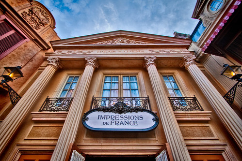
After seeing it for myself (just yesterday), I am quite pleased with the recent conversion of Epcot’s Oldest (Unchanged) Attraction. As I am sure most of you are aware, “Impressions de France” was quietly converted to digital projection. The color is amazing, the image stabilization is extremely well done, and the sharpness is astounding. The French Alps scene alone is literally breath-taking! In short “Impressions” is quite Impressive!
It is a testament to the filmmakers that this is the one presentation in all of Epcot that has endured in its original form. From Norman “Buddy” Baker’s lush arrangement of France’s greatest classical music to the artful cinematography the film sets the standard for which all travelogues should be judged. Based on previous reports it was thought that the film was set to be re-shot soon after Canada’s replacement, I am quite relieved that WDI decided to simply update its technology and not it’s content. If it’s not Baroque do not fix it! Canada, China, and yes even Mexico needed their changes (badly), but France’s Fantasia has stood the test of time. No improvements necessary, a simply perfect attraction.
That being said I would change the last 30 seconds of film, to cross-dissolve from the pre-millennial Eiffel Tower to the sparking strobes of the last ten years. (Maybe with some LED’s behind the screen just to make it really pop) But in those two sentences, I probably cost the company at least $50,000 so let’s just save that for next year’s budget!
Speaking of Wide Screen presentations, you may notice that E82 has become a little wider today with additional graphics flanking the sides of the site. (It took for forever to come-up with a repeatable pattern that would fit the site and, as silly as its sounds, its final color design was actually inspired by one of my neckties!)
Stay-tuned later this week as I can clearly see a new Vista “growing” in the distance!
 Joshua L Harris | in
  France | tagged
  Commentary,
  France,
  Impressions de France,
  World Showcase |
  Post a Comment |


Reader Comments